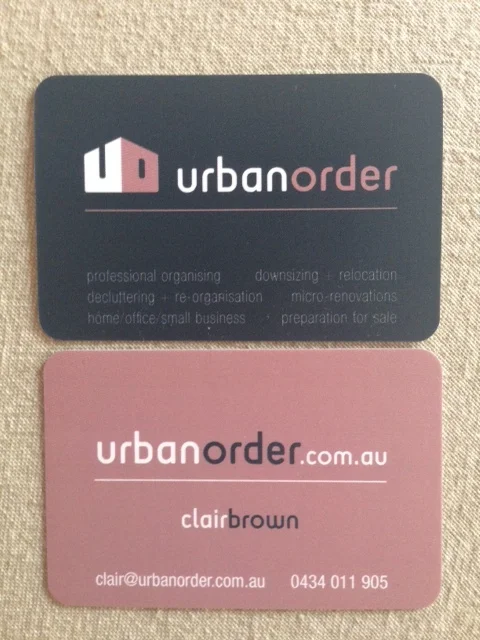
Urban Order
Clair, from Urban Order, had a very particular brief for her brand identity–reflect her business concept of “making your home or business more ordered, functional, clutter free and enjoyable” and wanted a logo that was “clean, symmetrical and simple”. Challenge accepted! After an initial concept round Clair was rather taken by a design that reflected her core ideas - ‘tidy’ and ‘home’. So we developed the logo that kind of echoes the silhouette of a house whilst also looking like a box, without being too boxy. The client was very happy with the result!


A selection of logo concepts that were in contention but didn’t quite make it.